Nam Packaging
Developed, designed, and produced a fictional product and exhibition campaign for the World Food Expo 2012. The fictional product was branded, packaged, and a trade show space was designed for the product.


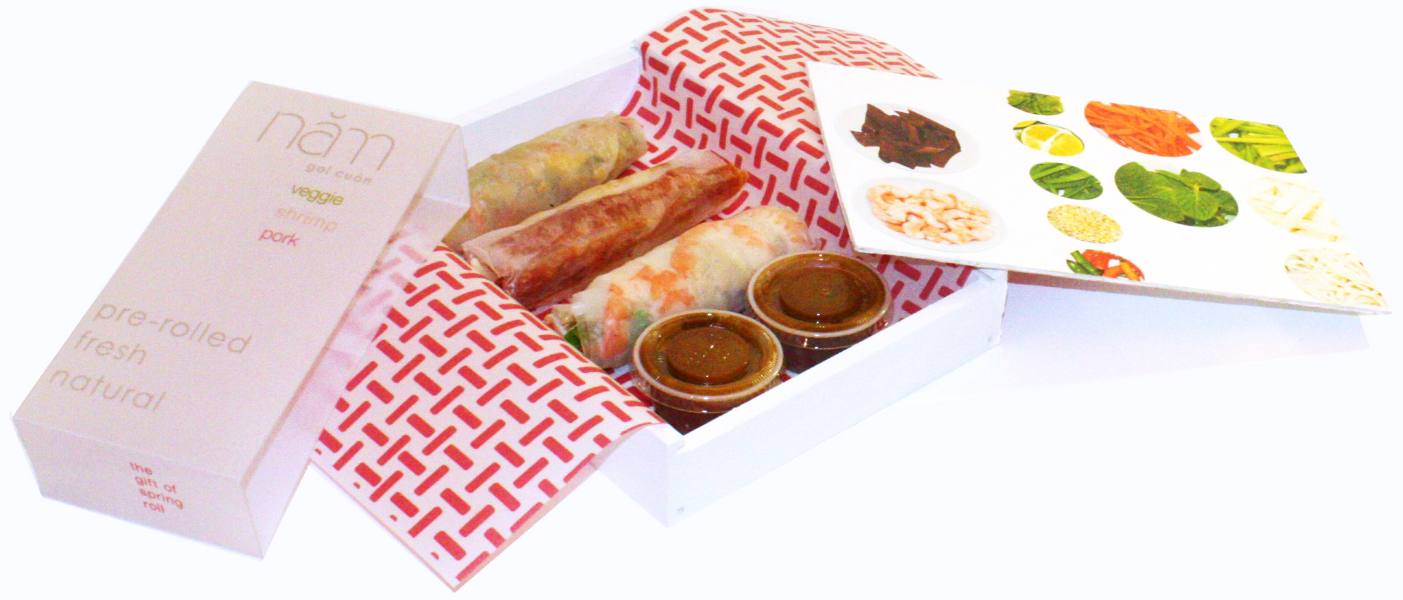
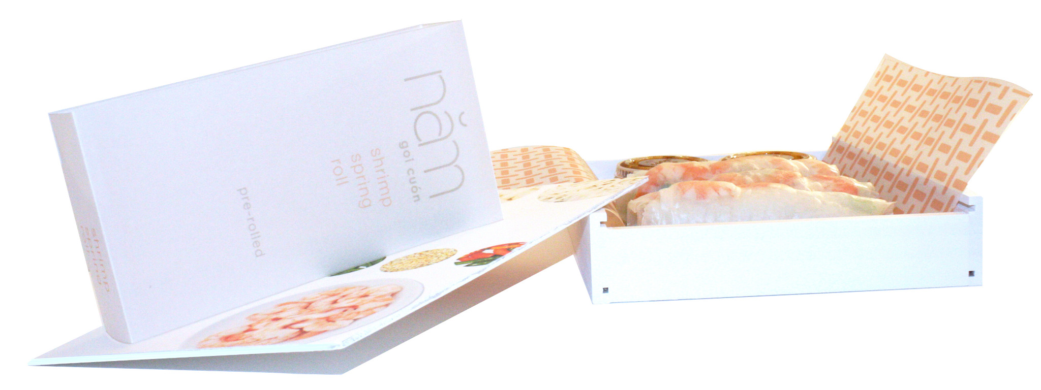
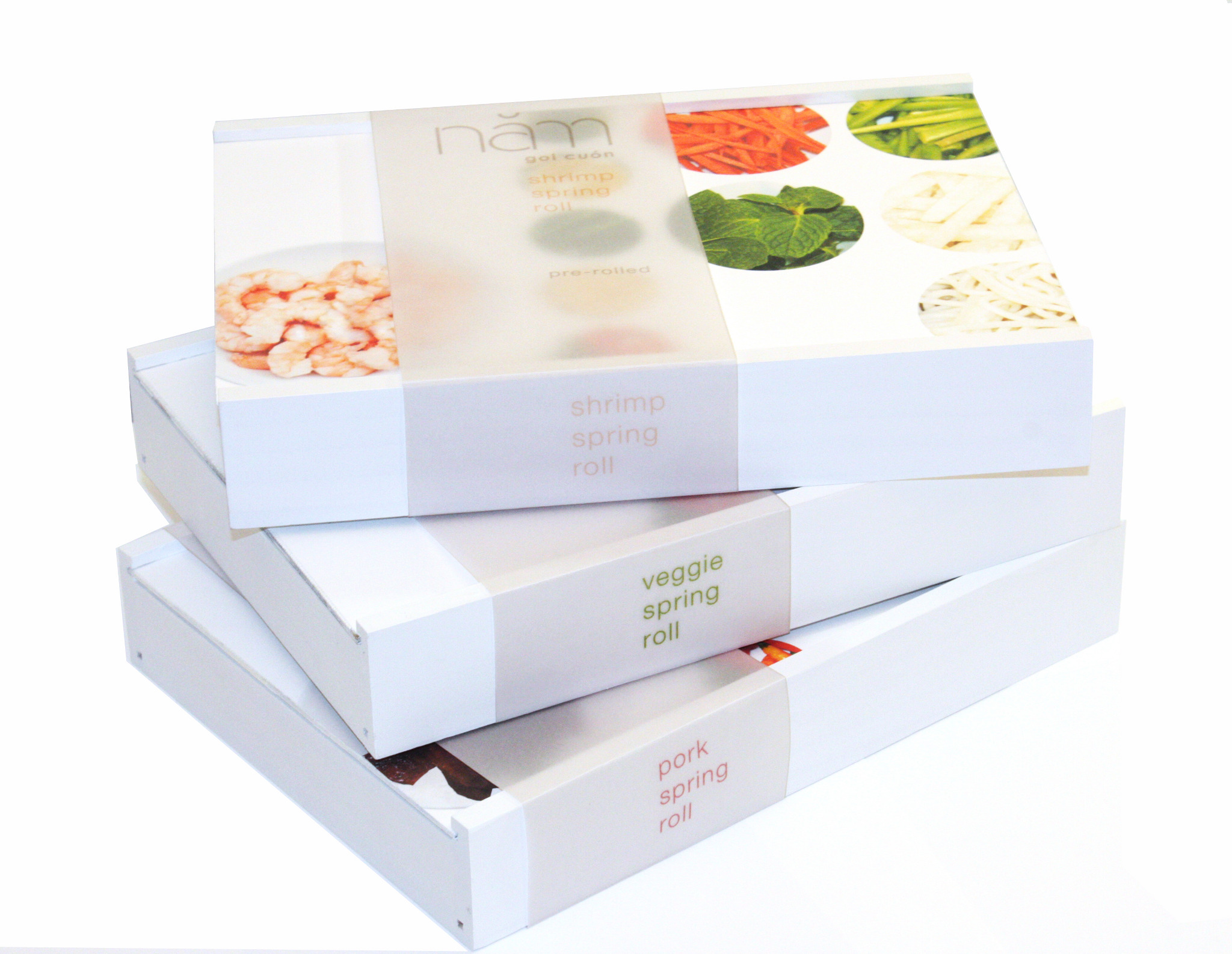


About the design: A slide top, wood box packaging, the only color shown on the packaging coming from the ingredients themselves. The packaging offers a simple, clean and modern take on the Vietnamese comfort food. Nam packaging also offers a experience for all five senses to engage in, following with Vietnamese methodology in cooking.
Legorreta Typeface
The Legorreta Typeface, "Light", is a typeface based on research, analysis, and experimentations. "Light" is based on the fundamentals of Ricardo Legorreta's philosophy on his architecture. This was a conceptual design based on his theory of allowing "Light " and nature in all of his designs.
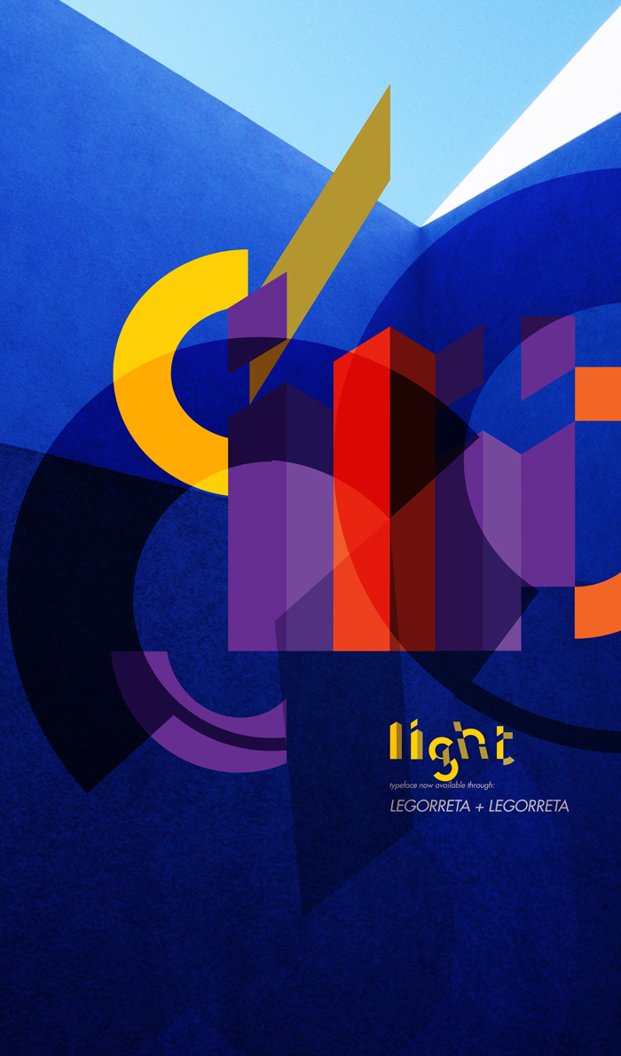

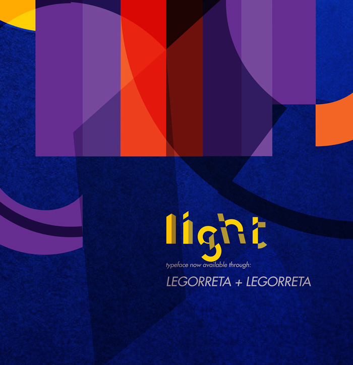

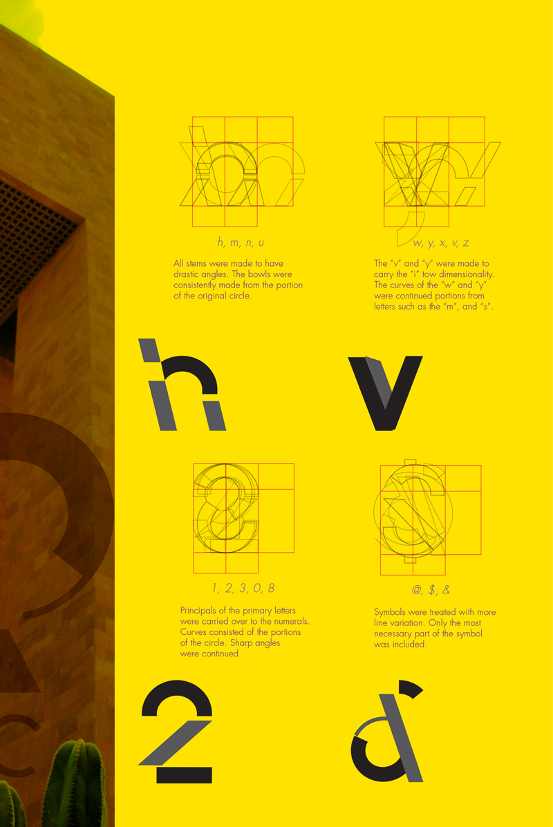

Featrued Poster Design
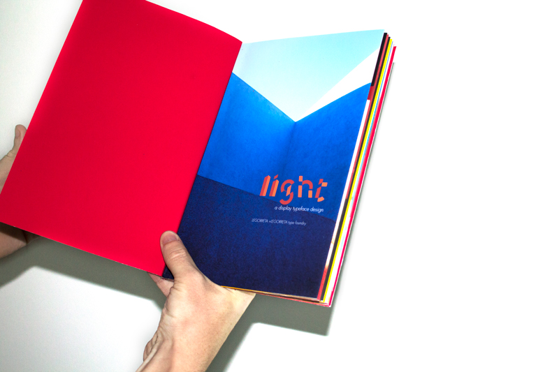


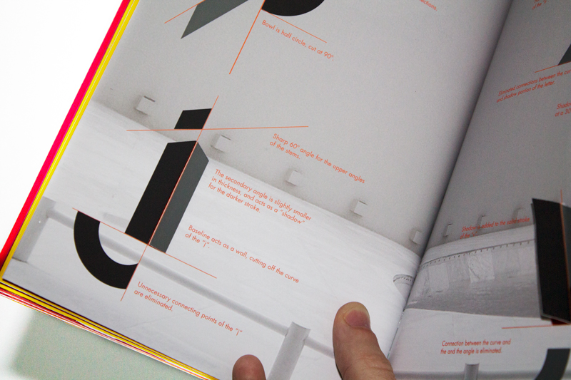
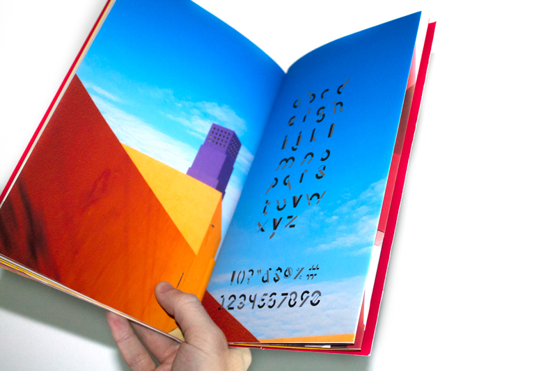
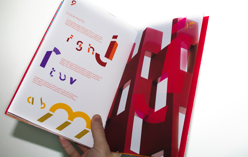
A Brochure was created to display the creation of the "Light" typeface, and illustrate the anatomy of the typeface itself.
Earthquake Fault Infographic
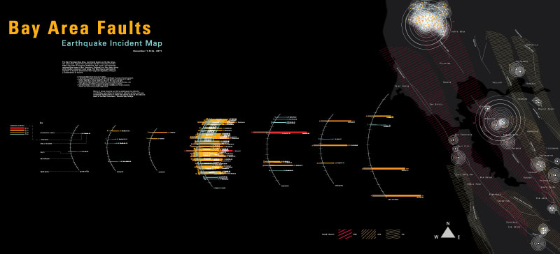
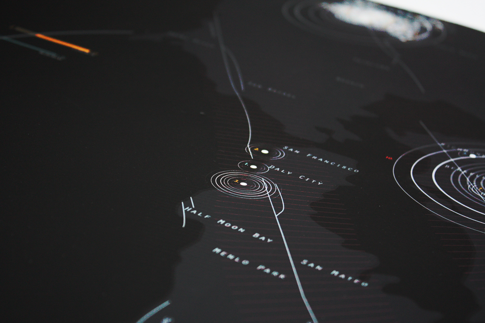
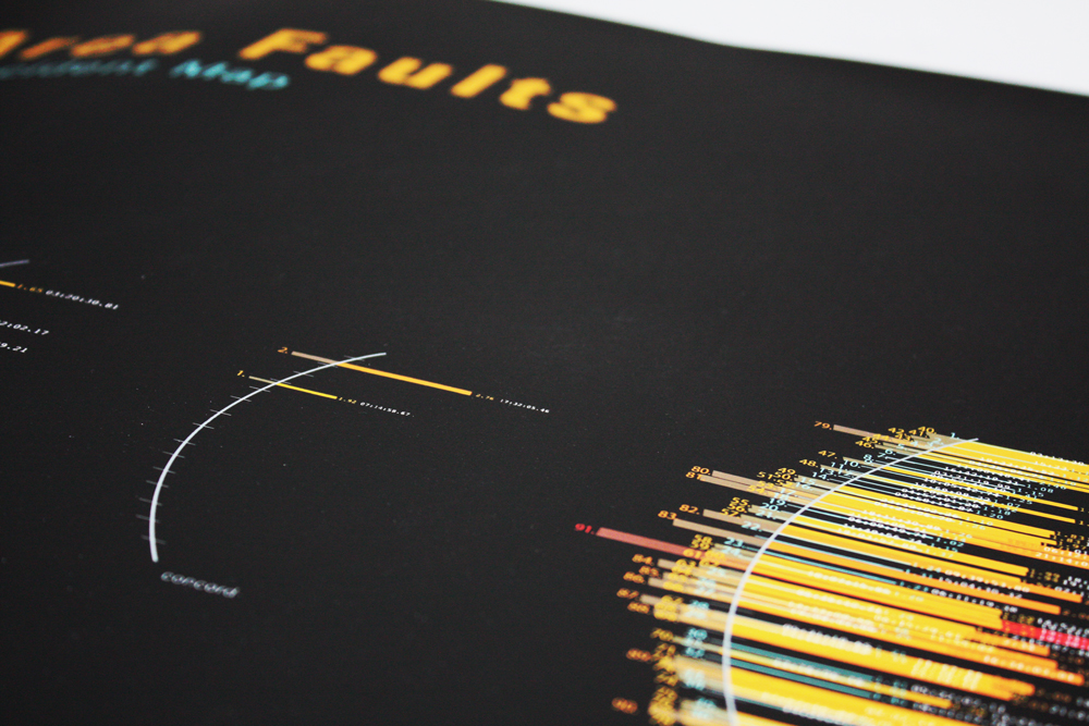
Bay Area Earthquake Incident Map for mapping all the fault incidents for a portion of the month of November 2011. The information should be easily accessible in both macro/micro views. Each incident shows the magnitude, depth, location, fault line and time.
