Adobe Help article redesign - component rationalization
Create a consolidated, optimized set of components to leverage in the Help article.The problem
The Help Article redesign had several mandates: drive find-ability via search, start to drive a consistent user experience across all global support content, enable users to consume support content responsively, build a scalable infrastructure, and align the redesign with the Adobe.com aesthetic.
To learn about the template rationalization portion of this project, read more about it here.
To ensure a consistent user experience, it was essential to have a consolidated component inventory that could be leveraged across the Help ecosystem. After completing a scrub of all components that existed, we discovered there was a total of 92 components. It was acknowledged by the team that maintaining this huge inventory was not scalable, that the mass quantity of components contributed to visual inconsistency, and there was a much needed rationalization of these components for the new re-designed Help Article.
Team and stakeholders
Content team
The content team gave numerous insights on the author workflow. I looked to this group to give feedback regarding the authorable aspects of the template. The content team was the liason between the Product team, UX team, and the authors.
Product team
I worked alongside a Design Manager who provided support with leadership and feedback. I relied on UX team reviews and feedback from my other User Experience colleagues. Product Management and Program Management were also key members of this redesign project team.
Engineering team
The Engineering team worked on the technical mappings of merged components, and retiring components from the ecosystem.
The Design Process
Upon investigation of all the inconsistencies of visuals across all the help articles, it was a common theme to see many components used in ways that strayed from their intended purpose. For example: authors used the table component in different variations to create different formatting presentations and in some cases, used a hub router presentation on an article. There were several permeations of “related link” presentations across Help articles as well, with 4-5 different title usages.
Key actions:
- Conduct an inventory of all existing components
- Identify which components can be merged, or eliminated due to duplication
- Identify the improvements that can be made to a component to optimize its use
- Eliminate features in components that were creating visual disparity on templates
- Try to identify the most “abused” features of components by authors and see if standardizing would help improve visual consistency
- Identify which components were not responsive, and improve
The result
After the rationalization, the previous total of 92 components was reduced to 28 manageable components for the Help Article. To do this, the author workflow had to be taken into account. Many of the 92 components were merged during a migration to ensure existing content could inherit the new 28 redesigned components. The 28 components had to consider and address all author workflows, but also ensure visual consistency when used.
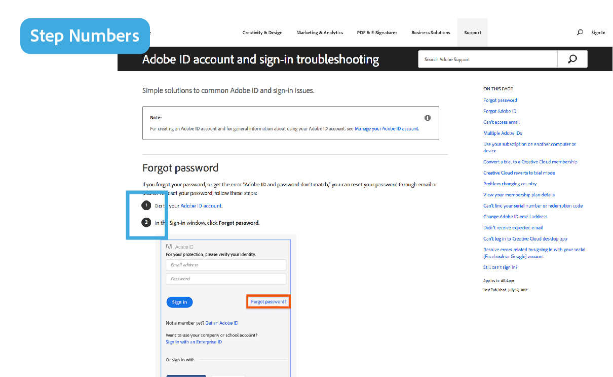
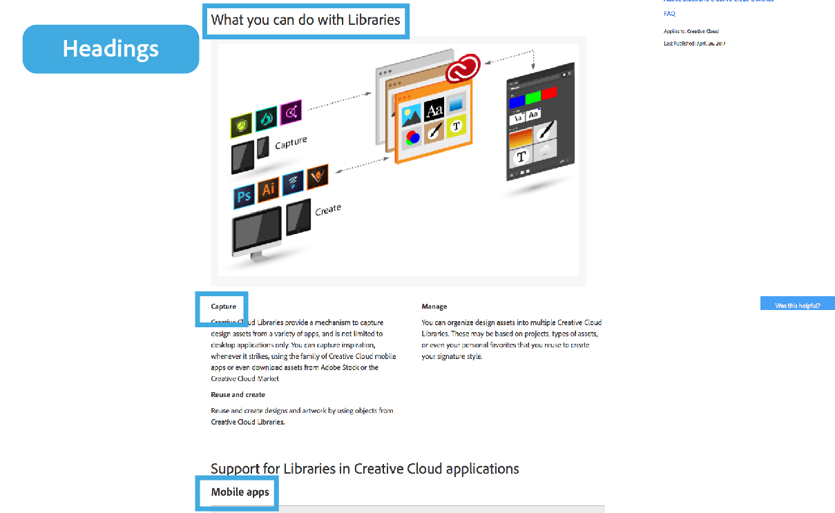


Some examples of the component redesign
Retrospective
The first phase of the migration was completed. Many components could not be retired because they either required a complete migration or complete retirement of the templates they were used in. On some newly migrated pages you can see remnants of the old visual components because hand authoring is required to truly adhere to the new visual design.
Now that authors have spent some time in the new template, they have been requesting fine tuning to components. These improvements are slated for future UX enhancements to start iterating on these components.