Adobe Help article redesign
Creating a universal template solution for Help content.The Problem
The Help Article redesign had several mandates: drive find-ability via search, start to drive a consistent user experience across all global support content, enable users to consume support content responsively, build a scalable infrastructure, and align the redesign with the Adobe.com aesthetic.
The help ecosystem prior to the redesign had several versions of help articles that lived in several different variations of templates and visual styles. After completing a scrub of all existing templates across the help ecosystem, the team discovered that there were 18 different template types being leveraged for help articles. This visual inconsistency was confusing to the user when attempting to navigate the self-help ecosystem.
The purpose of the Article Template in the Adobe ecosystem is to serve as the “solution” page. It does not serve as a router to other pages or as a hub page. The article page’s purpose is to provide answers for a specfic topic or question. If a page started to cover a wide range of issues, content authors were encouraged to break the content up into separate articles.
 There were 18 total article template types in the Help ecosystem prior to the redesign. Above is just a select few.
Constraints
MVP “state”
Historically, templates were created to serve different types of help content: how-to, account management, download and install, product features, error articles, FAQs, etc. The goal was to design an article template that would serve all of the authors’ content needs while maintaining visual consistency for our users. Due to a lack of author resources dedicated to such a large volume of content, we had to migrate all existing articles in various templates into a single template. This meant that we could not spend the same amount of resources to optimize the template to its ideal state, but instead the new article template had to flex to take in many different content streams.
Culture Change
Part of this project included an author mindset and culture change, meaning that authors had to be sold on the idea that this single article template could serve all their needs. Many authors had specific workflows they wanted the template to support, and they were accustomed to having full reign of nearly any template appearance at their fingertips. Authors were also in the habit of creating custom looks and styles to support their content. Our challenge to the authors was to do the reverse: write content in a way that maps to the new template structure.
Team and Stakeholders
Content Team
The content team gave numerous insights on the author workflow. I looked to this group to give feedback regarding the authorable aspects of the template. The content team was the liason between the Product team, UX team, and the authors.
Product team
I worked alongside a Design Manager who provided support with leadership and feedback. I relied on UX team reviews and feedback from my other User Experience colleagues. Product Management and Program Management were also key members of this redesign project team. A key Localization member was also consulted to ensure we were considering our international stakeholders.
Engineering Team
The Engineering team supporting this effort did an innumerous amount of technical mapping for the migration of the old templates to the new Help article template.
Design Process
- Reviewed Authoring Workflows provided by the authors
- Conducted assessment of each template in the Help Ecosystem and generated proposal for templates to be retired, templates to be migrated to the new article template via script, and templates to be manually migrated in the new template via hand authoring
- Worked with Content Strategy team to outline list of all components in use across templates, and propose components to be retired from system vs. kept for use going forward. Each component with proposal to retire included a mapping to a component that would exist in new article template, which was then handed off to Engineering for technical mapping of the scripted migration. Each component with proposal to keep in new article template had purpose and usage of component defined by UX. More about this here.
- Determined product and content associations that could be addressed through tag properties, which would eliminate some hand authoring and create consistency across documents in the ecosystem.
Many wish-list items were not in scope for Engineering due to resource constraints, like a tool bar feature in the header (see below). Due to right rail contraints in the prototype, we had to reduce the information to present only the table of contents. The inclusion of a tag cloud was denied due to the fact that there was not enough bandwidth to tag thousands of articles.
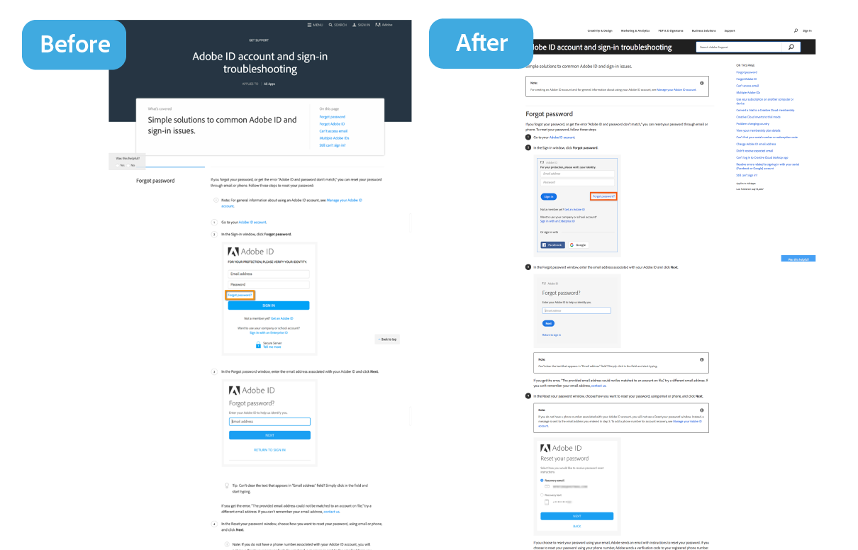
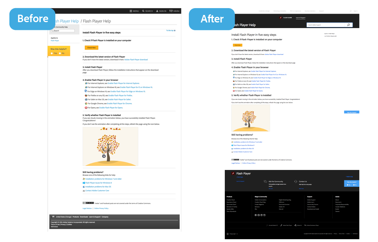
In the design evolution, the page title presentation had to move due to accessibility and to accommodate the large number of locales that have to be supported in the content ecosystem. The product association on the right rail, called “Applies to”, was promoted lower on the right rail, and the visual mneumonic was dropped. The breadcrumb moved to the top of the page, due to the demotion of the page title. Search moved to sit with the title in an effort to slim down the header and to promote search on the template.


Visual Design

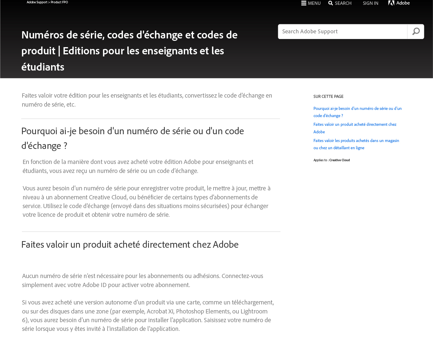
After rationalization, all 18 templates were mapped and migrated to one global, responsive article template. See them here live.
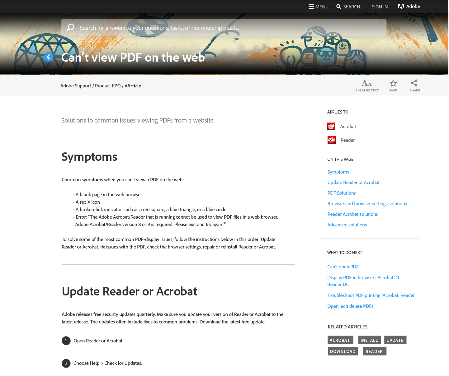
Main template elements for the Help article:
Universal header
Clearly states the title of the article. Search is prevalent for user ease and to encourage browsing. Header is “sticky” on scroll, to account for the long length of the content articles.
Contextual footer
Orients the user with content product help links and relevant product links. Contact support links and relevant product forum links were also included.
Contextual right rail
Due to the long length of the article content, user data reflected the users’ desire to jump to specific sections of an article based on what seemed most relevant to them. Having a persistent right rail allows the user to scan section titles in the table of contents for parts of the document specific to them to browse directly to.
See some of the before/after redesign comparisons here:
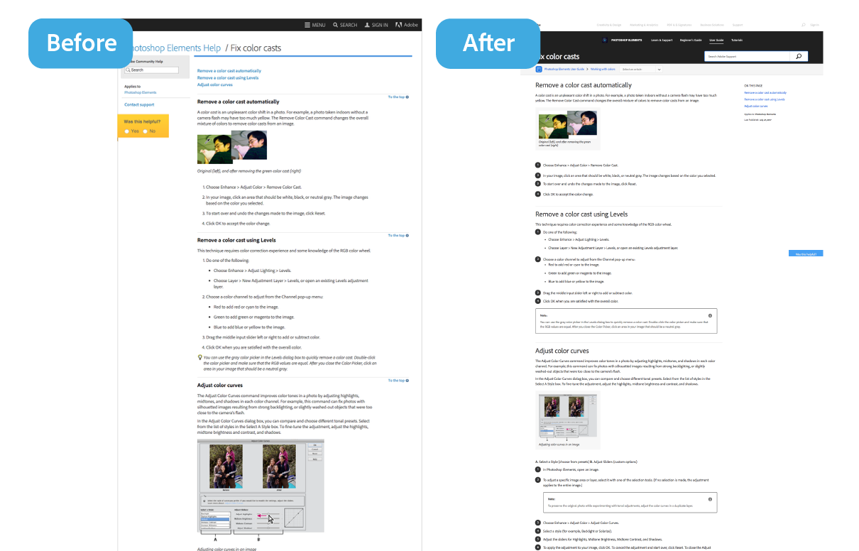
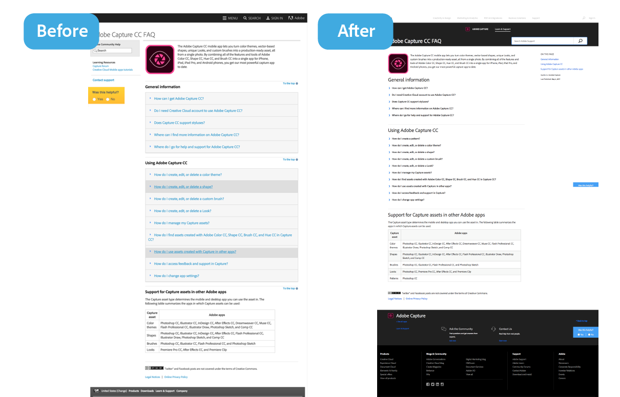


See them live: Adobe Capture FAQ, Creative Cloud Libraries, Fix color casts, Flash Player Help, “Error Compiling movie”, Adobe ID account and sign-in troubleshooting
The Result
As pages were being migrated from old templates to the new article template, positive ratings on the pages were increasing by 5% in some cases, specifically for the Adobe Illustrator, Photoshop, and Lightroom content. International content in the new template saw overall increase in positive ratings. Bounce rates in the new article template dropped as well. Time Spent on page increased from 11% to 14%, and traffic from search increased on new article templates as a result of the improved page structure.
Retrospective
Authors
Though the redesign had key content players, the authors felt misinformed about the elimination of the template flexibility. I wish socialization to authors about the goal of the project and the intent to increase user consumption had been emphasized more and managed continually through the project.
Migration
Even though we achieved the goal of the migration of thousands of pages into the new template, we still were not able to “fit” some content into the new visual presentation. Many pages still require a hand authoring touch in order to adhere to the visual style of the new template.